
Luxel Bulbs
For Luxel, the product imagery needed to carry the experience. We built a cleaner Shopify storefront around it with less interface noise, clearer hierarchy and a faster path from inspiration to product.
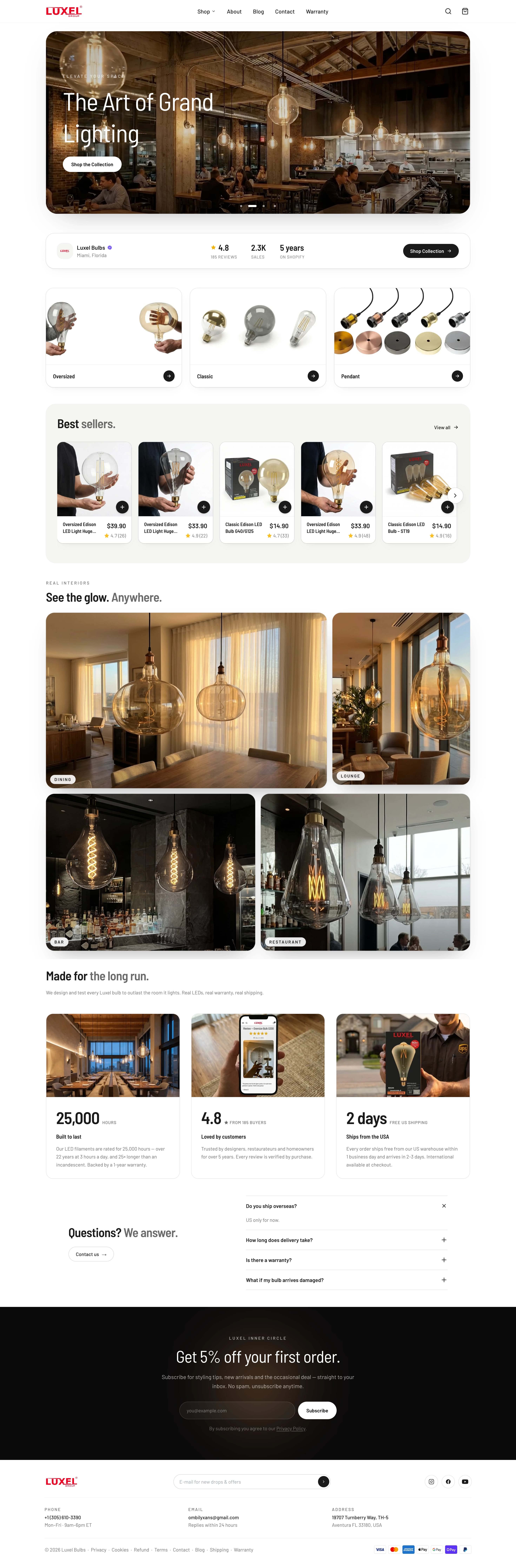
A quieter storefront for a product that already makes a statement.
Lighting is visual, but the store still has to make browsing obvious. Too much UI would compete with the imagery; too little structure would leave customers searching for the next step.
Built around the job the store actually has to do.
We simplified navigation, tightened product presentation and rebuilt the responsive hierarchy around the way customers actually browse. Calls to action stay direct, imagery gets room to work and the interface remains consistent as the screen gets smaller.
Less friction.
More control.
Product photography stays the visual priority
Simple hierarchy keeps buying actions obvious
Responsive layouts preserve the same clarity on mobile
See it in the wild.
The work is live, in use, and built to keep moving with the brand.
Have a project in mind?
Tell us what you’re building. We’ll figure out the right way to make it happen.